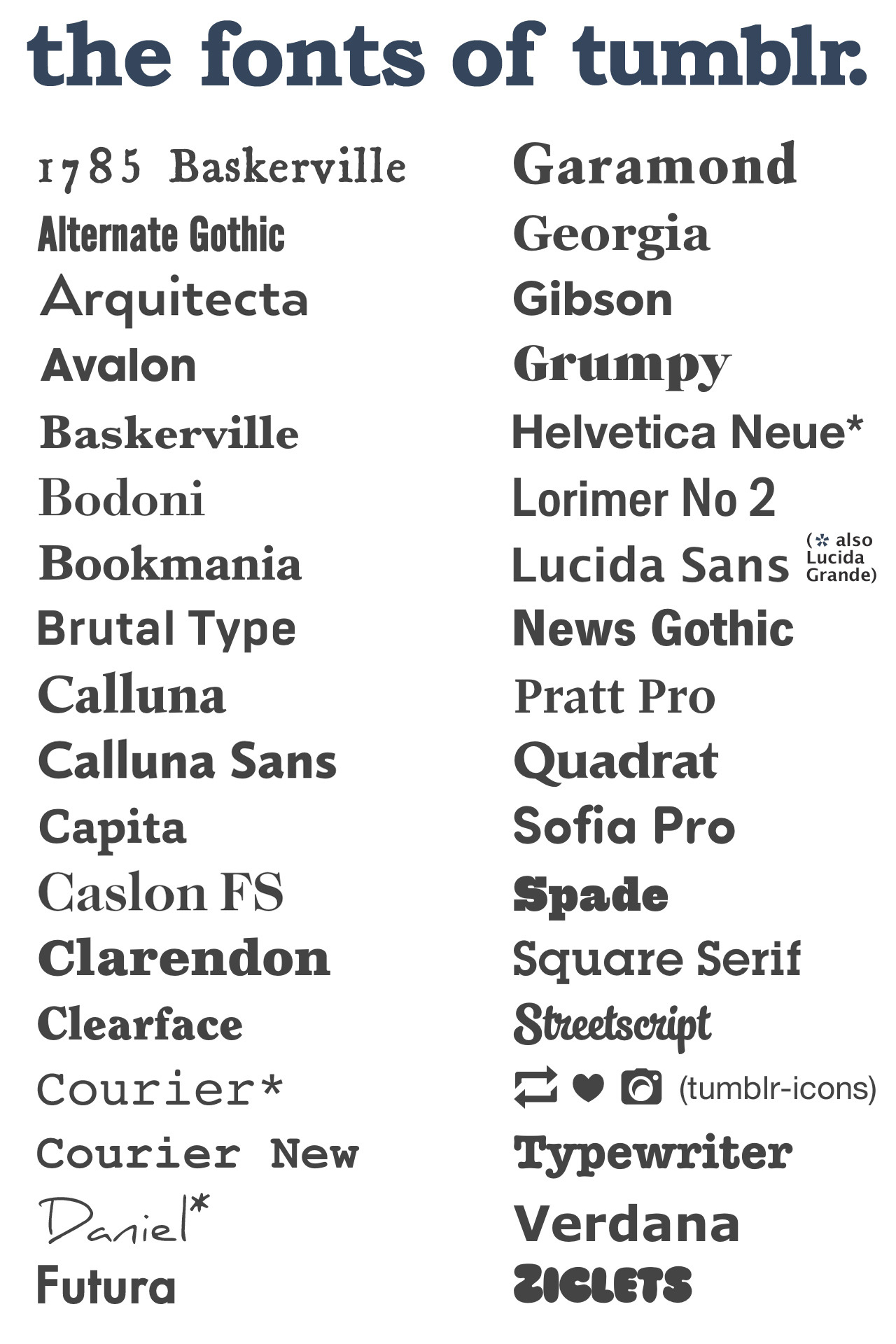
Writings and Fonts.
Movie: Get Smart (1965)
The way they used the fonts at the start of the film flowed well within the scene and it didn't feel as if something was covering what was also being shown. With the name of actors and directors for films being important to show the audience who was starring in the film hence the reason they added writing to the start of the opening scene. The writing used though in the middle of the screen it blended in nicely and the font of the writing matched the feeling being shown on the screen.
https://www.artofthetitle.com/title/get-smart/
Movie: Men In Black (1997)
With Men In Black and with the storyline being about aliens the font of actors and directors included should match the storyline and with the font they used I feel it does as the font is skinny with little round balls going through it. It can remind you of stars which links to space and with the writing it looks different it longer and slim which gives the feel of it being and looking abnormal. Which links to the film which is about aliens which are abnormal. This goes well with the film even though again the writing is in the middle of the screen and the scene continuing behind your attention isn't drawn to the writing they both feel natural together.
https://www.artofthetitle.com/title/men-in-black/
Movie: The Haunting (1963)
The use of fonts in The Haunting matches the name of the film as well as the storyline with it being about ghosts the fonts used matches the film as well as the colour of the fonts being white and with white being a colour that represents ghosts it was smartly done. Though this time the writing was again down the middle but the background was the same throughout the opening scene. Which means more of the attention will be put on the writing shown on screen as the background doesn't change. Then from the 0:39 - 0:49 a different font is show and that is the title of the film this also matches the feel as the fonts is more curly and gives the imagery of ghosts. Which is why it blends in well with the opening scene.
https://www.artofthetitle.com/title/the-haunting/
The use of fonts is important as if the font doesn't match what is being shown on screen audiences can create a disliking to the film as the first scene is important to grab the audience attention which means everything that is being shown should be as important. So if directors want to show writing at the start the font has to be matched rightly with the film. As well as at the start if you are showing the audience actors and directors that were involved in the film you want it to be eye catching for the audience so they don't miss this added information at the start of the film. Though font is important it is also important to think about the placement of where you put the writing as if you are showing a scene behind you don't want the audiences attention to be in different areas. As well as colour you can be smart with colour and match it with the storyline and with any stereotypes which consist of that colour, so red links to blood etc. All things that should be thought about before adding any writing to the scene. As well as thinking how to integrate the writing into the scene so it flows naturally and doesn't feel forced.


Comments
Post a Comment